
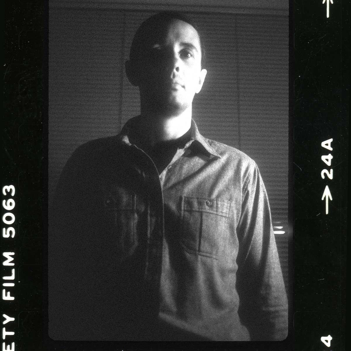
By Eric Jones –
In the mid 1970s, designer Leonard Pollikof and I were making fabric history in a blacked out storefront in Los Angeles. A few months earlier Leonard had founded California Drop Cloth in his West Hollywood apartment.
In a brilliant fit of inspiration, Leonard bought some used drop cloths right off the floors of painter’s studios. He had them dry cleaned and used the drop cloths to upholster his walls. He also hand-painted a few stripes on some pillows. Then he invited all of the designers he knew to a party.
Designer Leonard Pollikof, 1980
Pollikof’s aesthetic experiment was an immediate hit and he began filling his friend’s requests for hand-painted fabric by painting it on his ironing board, then pulling it out the door and down the hallway of his apartment building to dry.
Quickly out-growing his ironing board, Pollikof rented a small commercial space on Olympic Blvd., and teamed up with me. I was a fine art painter about to graduate from Art Center College of Design. At first we took turns painting Leonard’s original few designs, Balboa, Basketweave, Sand & Shells, Half-Moon Bay, Ciccolet Bold and Ciccolini.
Most of the early California Drop Cloth patterns were hand-painted versions of decorating staples: wobbly stripes, atmospheric solids, irregular basket weaves, and dots in the form of splatters.
We painted in shifts on a 16 foot table made from two sheets of plywood on saw-horses. Heavy cotton duck canvas was rolled out and painted with a variety of tools including foam brushes, sponges, and wallpaper brushes. Other instruments were tied to specific patterns, such as earwax bulbs for thin lines, toilet brushes for misty spatters, and paint stir sticks for bolder splats.
A watery mix of Ameritone latex house paint was used, with formulas scribbled on index cards and tacked to the wall. Matching production colors to the memo samples was approximate at best, and customers were constantly reminded that this was a hand-painted product with natural variations.
A vernacular style developed based on these tools, the viscosity of the paint and a number of other variables. Pollikof and I struggled to find ways of ensuring consistency across the orders since everything seemed to affect the outcome, from relative humidity to the arm length of the painter. I was adept at painting all of the available patterns so I took over the painting duties while Leonard focused on marketing.
I loved inventing new techniques, often by happy accident. One day I painted a wide wet stripe and ran a strong accent color line next to it. At points the accent line collides with the wide stripe and the richer color bleeds into it. The original version, in sand and aqua, had the appearance of sand meeting the sea, so I called it Morocco.
Due to physical limitations and fabric drying time we were only able to produce about thirty yards of fabric a day. Leonard would take the rolled up yardage, sometimes still moist, in the trunk of his car to the Keisling Hess company for finishing. Picking up the previous day’s haul, he would shed his coveralls and drive his leased gold Cadillac straight to the Pacific Design Center. The fledgling fabric line was represented there by the Harrison Van Horn showroom.

California Drop Cloth design director Eric Jones, 1979.
Meanwhile, back at the storefront, I was designing what would become the first full collection of California Drop Cloth. The collection included now iconic designs like Morocco, Marbella, Birds of Paradise, Seaspray, China Rose, Water Lillies, Waterline Lillies, Clover, Tiger-Tails and Feline. I also created the logo, which is really just my handwriting, and the first magazine ad for California Drop Cloth, which ran in the fall of 1978.
Morroco was a hit, outselling all of the previous patterns and winning the Pacifica Award. But reproducing the effect consistently was always an issue; too wet meant too much bleed, too dry meant not enough, so producing each yard was a tightrope act of pacing and precision.
All of the early California Drop Cloth patterns were painted on dry canvas, but with the positive response to Morocco, I decided to try more wet-on-wet painting. I moistened 10 yards at a time then quickly painted stripes into the moist fabric. It was a production risk, given the variable of drying time, but resulted in a gorgeous pattern called Marbella. Leonard said that I had made canvas look like silk.
Further experimentation with wet-on-wet techniques, including tinted backgrounds, revealed new problems with shrinkage and timing. The “foot end” of the cloth was drying before I could make my way back from the head end with the stripes, resulting in a bleed overlap line when I moistened the next section.
The solution was to use two artists, one moving ahead, moistening the whole yardage at the same pace that the second painter was following, creating the pattern. In the summer of 1978 I hired my friend Julia Bieniarz (aka “Ika”), a fellow Art Center alum, as a part time painter. In doing so I established our basic apprentice training. I taught Julia the patterns, color mixing and painting techniques. While she was assisting me on the tables she also was imagining her own patterns.
Painter at California Drop Cloth creating yardage of ‘Balboa Stripe’
Although using a second painter made the wet on wet patterns more expensive to produce, by working in tandem we learned how to produce most of the other patterns in half the time, painting from opposite sides of the table with each reaching across to pull a stripe in rhythm. All future California Drop Cloth patterns were designed for team painters.
Leonard Pollikof was now was selling more fabric than could be produced and production lead times grew to more than six weeks. From humble beginnings in a single showroom at the PDC, he had lined up many of the best showrooms in the country to carry California Drop Cloth, including David Sutherland in Dallas and Houston, Jerry Pair in Atlanta and Miami, and Groundworks in New York. Pat Green of Groundworks was a true advocate, and instrumental in encouraging the growth of the company.
My pattern Birds of Paradise won the ROSCOE Award from the Resources Council. Water Lillies was used on the set of the Phil Donahue show and another pattern, Ravenswing was translated into a printed version for bags by Nieman-Marcus. California Drop Cloth got mentioned in Egon von Fürstenberg’s popular book ‘The Power Look at Home – Decorating For Men Home‘ and the business really took off.
Around this time I began experimenting with stencils that I would cut out from large sheets of paper. My stencil designs China Rose and Water Lillies added a whole new dimension to the product: a hard edged shape with hand-painted variations within. I also started employing metallic pigments and automotive pearlescent pigments purchased from a company called Sparkle-It in the San Fernando valley.
We had already outgrown the small storefront and began searching for alternatives. We leased the old Masonic Temple on the second floor of 706 Pico Blvd. (later demolished to make way for the Los Angeles Convention Center expansion).
Like many Masonic Temples, the large space had a stage at one end and a balcony at the other. We installed three ten yard tables in the central area, put desks and file cabinets on the stage, a color mixing area below the balcony, and Leonard’s office near the entrance.
To keep up with the accelerating demand, I hired a group of my friends from Art Center College of Design, including Ken Klos, Laurie Halpern, James Griffith and Kate Altman. There was a high turn-over, as most were fine artists with bigger dreams than painting upholstery fabric.
In the loft across the hall lived Peter Bosch and Allison Foster. Pete was a professional photographer so I hired him to shoot our first magazine ad, for Morocco. Allison became my main painting assistant whenever Julia wasn’t working. Kate, although a designer, showed proclivity for the administrative side which was much needed. She sat on the stage, answering the phone and dealing with customer issues. She eventually became vice-president.
Leonard and I realized that there was no economy of scale in the hand-painting business. Each yard took the same amount of time to produce whether we were making five yards or 500 yards. Part of my thinking behind the stencil designs was that they would be an easy transition to screen-prints when the time was right. The stencils needed to be replaced about once a week so this became a task for new hires, along with producing yardage for memo and wing samples.
The scrubbed backgrounds I used for patterns such as Feline became popular as solid complements and we produced thousands of yards simply called Scrubbed Cotton. It was produced by dunking a large car-washing sponge into a bucket of watery paint, squeezing it out to just the right saturation, then scrubbing lightly in a circular motion leaving patches of dry canvas. Scrub too hard or wet and the fabric became saturated which ruined the effect. Learning just the right touch and arm motion became another important lesson for journeymen painters. It also taught us to predict the amount of shrinkage to expect from a thirty yard run.
When we scrubbed over the selvedge paint got onto the table, and usually bled onto the back of the fabric, which was undesirable. We learned to slide a strip of stencil paper with our left hand, while scrubbing with the right, to protect the table from getting wet. Shorter painters such as Laurie had to stand on wooden boxes to attain their reach across the 54” canvas, and kick the box along as they moved down the table. Scrub, slide, kick in a rhythm that became part of the process.
We always had loud music playing and certain songs were conducive to particular patterns. I always listened to ‘Start Me Up’ by the Rolling Stones when I was painting random patterns like Ravenswing because keeping time with my strokes forced me to not overthink.
There was lot of waste or ‘scrap’ yardage. Every pattern was available in custom color-ways and customers would send us paint chips and other objects to match which usually took a few tries to get it right. The scrap canvas was given to the painters for their own artistic use – it was the same cotton duck we normally stretched for our fine art paintings. Very occasionally we used other fabric grounds such as sateen or raw silk on custom orders. Johnny Carson’s wife Joanna sent us a piece of printed upholstery that she had used in their living room. She asked us to match the colors and floral sentiment on Thai raw silk for some companion pieces.
Julia Bieniarz worked with us for just a few months but in that time designed one of the company’s most important fabrics, Columbine, a gigantic scale floral pattern. She combined my stencil and moist fabric techniques; dry-brushing through stencils onto moist fabric. This became another difficult but exciting technique which was applied to numerous designs, including her giant leaf pattern Brazilia.
These complex latter day patterns had departed radically from Leonard Pollikof’s original, simplistic designs. He’d always wanted a ‘Jackson Pollack’ style splatter pattern, and in late 1979 we came up with Celebration and Dropcloth. Kenneth Klos excelled at painting these patterns and was fond of wearing a tall paper hat on his head while he flicked paint from a toilet brush, mimicking the Pope, to the strains of ‘Psycho Killer’ by the Talking Heads.
Besides the Johnny Carsons, a number of high profile designers and celebrities started specifying California Drop Cloth. A short list from 1979 included Beatle George Harrison, Art Garfunkle, and Don Kirshner. Our fabrics adorned the set of the Phil Donahue show. We produced a vinyl coated version of Waterline Lillies for a new McDonalds restaurant in Toronto. Sunbrella became a customer and Marimekko approached us about doing printed designs for them.
Showroom expansion continued and now included Matches, Inc. (Philadelphia), Ostrer House (Boston), Shears & Window (San Francisco), Designers Showroom (Seattle), and Concinnity (Quebec). We parted ways with Harrison Van Horn in Los Angeles and moved to Donghia on Melrose Ave.
Leonard was spending a lot of time traveling to the showrooms and developing relationships with magazines, leaving me in charge of the day to day operations. My functions had evolved from designer to foreman to design director. I turned the balcony into my design studio, where I developed patterns and marketing materials while keeping an eye on the burgeoning production crew below.
Although I was officially California Drop Cloth’s Design Director throughout the life of the company, I kept my status as an independent contractor and retained the rights to all of my intellectual property including my patterns, graphic design, photographs, and even the logo. I earned a base salary plus design royalty on every yard sold.
In 1980 I moved to New York City, as did Allison and Peter. California Drop Cloth set up east coast operations in a loft on 26th Street around the corner from the Fashion Institute of Technology. The doorbell above ours was one David Jones (AKA David Bowie) whom we would sometimes see entering or leaving the building. Leonard, Allison and I took meetings at the loft with an array of business people including marketeer Ron Popeil, and David Bell of the Heberlein corporation of Switzerland.
We got a request from the San Francisco Museum of Art for a unique design to use in their public seating areas. For this I created a ‘wrinkled look’ fabric called Reverse. First I moistened a hundred yards of cotton duck, then crammed it tightly into a box and left it in the sun to dry. I rented a large hall at Sailor’s Snug Harbor in Staten Island and strung the crushed fabric along a cable. Using a compressor and automotive spray gun, my wife Pui-Pui Li and I painted the fabric from acute angles with different hues of pearlescent pigments.Once the yardage was steamed and processed by Keisling-Hess, the flattened fabric looked as though it was still wrinkled. It was fantastic.
Leonard and I were determined to create a printed fabric version of Reverse, and asked Heberlein to help us translate the concept. I put the pattern into repeat, no small feat in the pre-computer era, and Heberlein made copper gravure plates to support the detailed gradations. Unfortunately, the printed version did not have the surprise or charm of the hand-painted fabric, and looked a bit like elephant skin. Reverse was never sold, but the use of pearlescent pigments was about to drive California Drop Cloth’s leap into wallcoverings.
We also worked with Heberlein to produce a printed version of Ravenswing for Nieman-Marcus. At first they refused to consider using pearlescent pigments because the ones they were familiar with used a fish-oil base and tended to clog their screens. But the mica-based pigments that I supplied them with worked perfectly. Although a number of strike-offs were produced by Heberlein, the final printed versions for Neiman-Marcus were hand screened in Texas.
I gave the same pigments to a screen printer on Long Island to do some wall covering test runs. Several interesting wall coverings came out of those experiments including Linea designed by James Griffith. It was a gigantic scale pattern that could be arranged by the paperhanger to make it appear random rather than repeating. We also did repeating versions of Celebration in fluorescent glow-in-the-dark inks.
A few years later our original New York rep, Groundworks, produced a wall covering series called Beams using the same pigments. By that time my company was doing their marketing and advertising as well.
Leonard Pollikof was born in Michigan on July 5, 1940, and died April 5, 1990. He is buried at the Eternal Hills Cemetery in Oceanside, CA. His last name is sometimes incorrectly spelled “Polikoff”.